Top Tips for Boosting Your Site's Loading Speed on Mobile
Mobile is king when it comes to the web these days and its vital to ensure your website is optimised for mobile. Check out my top tips on the subject.
WEBSITE OPTIMISATIONCONTENT OPTIMISATIONSEO OPTIMISATION
Steven Dale
4/17/202511 min read
In today’s digital world, the significance of loading speed is paramount, particularly for mobile websites. As mobile usage continues to grow, it's vital for businesses to prioritise how well their websites perform on these devices.
Studies have indicated that users expect a website to load within mere seconds; if a site takes longer than three seconds to load, the likelihood of users leaving the site increases dramatically. This abandonment leads to a higher bounce rate, which can seriously impact user engagement and satisfaction.
The influence of loading speed goes beyond just user experience; it also plays a crucial role in search engine optimisation (SEO). Search engines, such as Google, take loading speeds into account when ranking websites.
A slower site may suffer in search visibility, which can hinder potential traffic and, consequently, affect business growth. Research suggests that a one-second delay in loading time can reduce conversions by up to 20%.
Therefore, improving site speed isn't just a technical improvement but also a strategic business decision. Furthermore, faster loading speeds contribute positively to overall mobile performance metrics.


For instance, optimal loading times can enhance the chances of users revisiting the site, leading to increased customer loyalty and potential revenue growth.
Various statistics emphasise this connection between speed and conversion rates. Websites that load within two seconds generally see significantly higher conversion rates compared to those that take longer. Thus, understanding the importance of loading speed on mobile devices is essential for anyone looking to enhance their online presence and drive sustainable business success.
Understanding the Importance of Loading Speed
Optimising Images and Media Files
Compression techniques can further reduce image sizes without sacrificing visual integrity. Tools like Adobe Photoshop, TinyPNG, or ImageOptim can effectively reduce file sizes by removing unnecessary data from images.
Implementing these tools as part of your workflow not only improves loading speed but also contributes to an overall improved user experience. Additionally, using plugins like Smush or EWWW Image Optimizer can automate the compression process for WordPress sites, ensuring that all images uploaded are optimised for mobile devices.
Responsive design is another vital aspect of optimising images for mobile. Using CSS media queries allows you to serve different images based on the user's device, ensuring that mobile users receive appropriately sized content.
This not only improves loading times but also preserves website aesthetics across various screen sizes. Consequently, investing time and resources into optimising images and media files is essential for enhancing your site's loading speed on mobile devices, ultimately contributing to better user engagement and satisfaction.


When it comes to mobile website optimisation, images and media files are key in determining loading speed. Large or incorrectly formatted files can significantly hinder site performance, resulting in higher bounce rates and user frustration. To improve your site's loading speed, it's essential to use the correct file formats, compress images effectively, and adopt responsive design principles.
Choosing the appropriate image format is crucial for achieving a balance between quality and size. Formats such as JPEG are often preferred for photographs due to their ability to maintain reasonable quality while reducing file sizes.
In contrast, PNG files are better suited for graphics or images that require transparency, though they typically have larger file sizes. WebP format is also gaining popularity due to its superior compression capabilities, yielding smaller files without noticeable quality loss.
Minifying CSS, JavaScript, and HTML
After selecting the appropriate tool, the next step is to upload or input your CSS, JavaScript, or HTML code into the platform. The tool will parse your code and remove unnecessary elements. For instance, with CSS, it's common to eliminate extra spaces, line breaks, and comments that don't affect the final output. Similarly, for JavaScript, superfluous whitespace and documentation comments are often stripped away. A well-minified JavaScript file can be considerably lighter, enabling faster parsing and execution by the browser.
Once minification is finished, ensure you test your site thoroughly. Check that all functionalities remain intact after the optimisation process. Additionally, using browser developer tools can help you analyse the loading speed before and after minification, allowing you to gauge the effectiveness of your efforts. Implementing these techniques can lead to significant performance gains, thereby enhancing the overall experience for mobile users.


Minifying CSS, JavaScript, and HTML is a crucial step in optimising website performance, particularly for mobile users. By removing unnecessary characters, spaces, and comments from your code, you not only reduce file sizes but also enhance loading speed. This process significantly improves the user's experience on mobile devices, where data speeds may vary. The aim is to deliver a leaner codebase that the browser can interpret more quickly, leading to better performance metrics.
The first step in minification is to choose the right tools. Numerous online services and software tools can automate the minification process, such as CSSNano for CSS, UglifyJS for JavaScript, and HtmlMinifier for HTML. These tools not only strip out unwanted characters but can also optimise the code structure, which is crucial for a faster loading time.


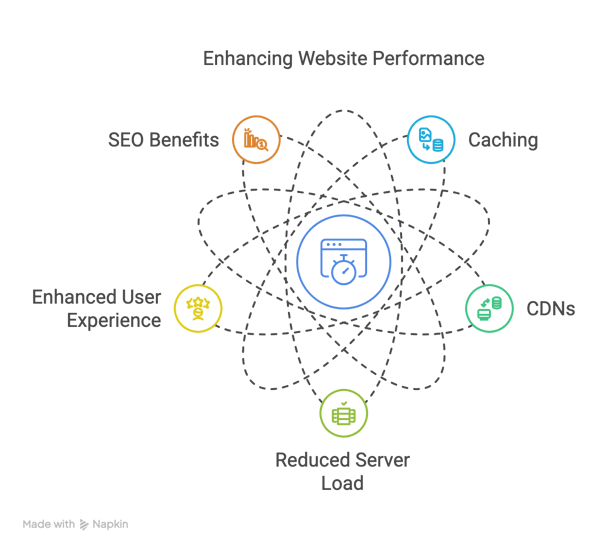
Caching is a fundamental technique employed to boost the loading speed of websites, particularly on mobile devices. Essentially, caching involves storing copies of files or data in a temporary storage area, allowing for faster retrieval upon subsequent requests. This process significantly decreases the time it takes to load web pages, enhancing the user experience. Various types of caching mechanisms can be used, including browser caching, server caching, and CDN caching.
Browser caching permits web browsers to store certain components of a website, such as images and scripts, locally on the user's device. When a user revisits the website, the browser retrieves these components from its local cache rather than downloading them again from the server, which considerably speeds up page loading time. Server caching, on the other hand, involves storing frequently accessed data on the server side, enabling quick responses to requests without the need to regenerate content each time. Furthermore, using object and page caches can minimise server load and optimise performance.
In conjunction with caching, Content Delivery Networks (CDNs) play a crucial role in enhancing website speed on mobile devices. CDNs consist of a network of servers distributed across various geographical locations. When a user accesses a website, the CDN serves the content from the nearest server to their location, which reduces latency and load times. This geographical distribution ensures that users across the globe experience faster loading speeds regardless of their physical distance from the original hosting server.
By leveraging both caching mechanisms and CDNs, webmasters can significantly improve their site's performance on mobile devices, thus providing users with a seamless and enjoyable browsing experience. These strategies not only contribute to faster loading times but also optimise server resource utilisation, leading to a more efficient overall operation of the website.
Utilising Caching and Content Delivery Networks (CDNs)
The Impact of Server Response Time
Implementing caching mechanisms at the server level, as discussed earlier, can also drastically reduce server response times. By storing frequently accessed data in memory, the server can retrieve and deliver information much faster without needing to process the same requests repeatedly. Techniques such as using opcode caching for PHP or memory caching systems like Memcached or Redis can be highly effective. Monitoring your server's performance metrics, such as CPU usage, memory usage, and network latency, can provide valuable insights into potential bottlenecks and areas for improvement. Addressing these issues proactively will contribute to faster loading speeds and a better mobile user experience.
Server response time is another critical factor influencing website loading speed, particularly on mobile devices. This refers to the time it takes for a web server to respond to a request from a user's browser. A slow server response time can negate the benefits of other optimisation efforts, leading to a sluggish user experience. Several factors can contribute to slow server response times, including server overload, inefficient database queries, and inadequate hosting infrastructure.
Choosing a reliable and well-optimised hosting provider is the first step in ensuring fast server response times. Opting for a server location that is geographically close to your target audience can also reduce latency. Shared hosting environments may experience slower response times during peak traffic periods due to resource contention with other websites on the same server. Consider upgrading to a Virtual Private Server (VPS) or a dedicated server if you experience consistent issues with server response time.
Optimising your website's database queries is another essential aspect of improving server performance. Inefficient or poorly written queries can put a significant strain on the server, leading to delays in response times. Regularly reviewing and optimising your database can significantly improve performance. Tools and plugins are available that can help identify and resolve slow-performing queries.


Adopting a mobile-first design approach is increasingly important in today's digital landscape, where a significant portion of internet traffic originates from mobile devices.
Mobile-first design involves prioritising the mobile user experience when designing and developing a website, ensuring that it functions seamlessly and loads quickly on smaller screens. This approach not only caters to the growing mobile audience but also positively impacts website loading speed and SEO.
With mobile-first design, the core content and functionality of a website are designed and optimised for mobile devices first. This typically involves creating a streamlined and efficient user interface that loads quickly on mobile networks. Elements that are not essential for the mobile experience may be omitted or deferred to improve loading times. As a result, mobile users benefit from faster page loads and a more intuitive browsing experience.
Furthermore, Google's indexing system now primarily uses the mobile version of a website for ranking purposes. Websites that are not mobile-friendly or load slowly on mobile devices may experience lower search engine rankings. Therefore, adopting a mobile-first approach is not just about user experience; it's also a crucial factor in SEO. Ensuring that your website is responsive and performs well on mobile devices is essential for maintaining and improving your search visibility.


Implementing mobile-first design often involves using responsive design techniques, which allow a website to adapt its layout and content to different screen sizes and devices.
This includes using flexible grids, responsive images, and CSS media queries to ensure that the website looks and functions optimally on everything from smartphones to tablets and desktops. By prioritising the mobile experience from the outset, businesses can create websites that are not only user-friendly but also perform well in terms of loading speed and search engine rankings.
The Importance of Mobile-First Design
Avoiding Render-Blocking Resources
Similarly, JavaScript files can also be render-blocking. Placing <script> tags at the bottom of the <body> element can help to avoid blocking the initial rendering of the page, as the HTML and CSS will be parsed and processed before the JavaScript.
For JavaScript that is not essential for the initial rendering, the async or defer attributes can be used to load and execute the scripts without blocking the parsing of the HTML. The async attribute loads the script asynchronously and executes it as soon as it is downloaded, while the defer attribute loads the script asynchronously but executes it only after the HTML parsing is complete.
Tools like Google PageSpeed Insights can help identify render-blocking resources on your website and provide recommendations for optimising them. By addressing these issues, you can significantly improve your website's loading speed, leading to better user engagement and search engine rankings.


Render-blocking resources are elements on a webpage, such as CSS stylesheets and JavaScript files, that prevent the browser from rendering the visible content of the page until they are downloaded and processed. These resources can significantly delay the time it takes for a page to load, particularly on mobile devices with slower network connections. Optimising or eliminating render-blocking resources is crucial for improving website loading speed and enhancing the user experience.
One effective strategy for reducing render-blocking CSS is to inline critical CSS. Critical CSS refers to the CSS styles that are necessary to render the above-the-fold content of a webpage. By including this CSS directly in the <head> section of the HTML document, the browser can render the visible part of the page immediately without waiting for external stylesheets to load. Non-critical CSS, which is used for styling content below the fold or on other pages, can be deferred using techniques such as the preload attribute or by loading it asynchronously.
Leveraging browser storage mechanisms, such as Local Storage and Session Storage, can be an effective way to improve website loading speed, particularly for repeat visitors.
These technologies allow websites to store data locally on the user's browser, reducing the need to fetch the same information from the server on subsequent visits. This can lead to faster page loads and a more seamless user experience, especially on mobile devices.
Local Storage provides a way to store data that persists even after the browser window is closed and reopened. This can be useful for storing user preferences, settings, or even cached data that is frequently accessed.
For example, if a user customises the appearance of a website, these preferences can be stored in Local Storage and applied automatically on future visits, eliminating the need to reload them from the server.
Session Storage, on the other hand, stores data for the duration of a single browsing session. The data is cleared when the user closes the browser window or tab. This can be useful for storing temporary information related to the user's current interaction with the website, such as items in a shopping cart or the state of a form.


By strategically using Local Storage and Session Storage, websites can reduce the amount of data that needs to be transferred from the server on each page load, resulting in faster loading times. For instance, frequently accessed static assets or API responses can be stored locally, and the website can check the browser storage first before making a server request.
However, it's important to use these storage mechanisms judiciously and to avoid storing sensitive information locally. Regularly reviewing and managing the data stored in browser storage is also essential to ensure optimal performance and user privacy.
Leveraging Browser Storage
Monitoring and Testing Loading Speed
In addition to using these tools, it's also important to monitor your website's performance using analytics platforms, such as Google Analytics. These platforms can provide data on key metrics like bounce rate, average session duration, and page load times for different devices and browsers.
By tracking these metrics over time, you can identify trends and detect any significant changes in your website's performance. Setting up alerts for sudden drops in performance can also help you to quickly identify and address any issues that may arise. Regular monitoring and testing will ensure that your website continues to provide a fast and seamless experience for your users.
Regularly monitoring and testing your website's loading speed is crucial for identifying performance issues and ensuring that your optimisation efforts are effective.
Website performance can be affected by various factors, including changes in content, traffic volume, and updates to your website's code or third-party services. Therefore, it's important to establish a routine for monitoring and testing your site's speed on a regular basis.
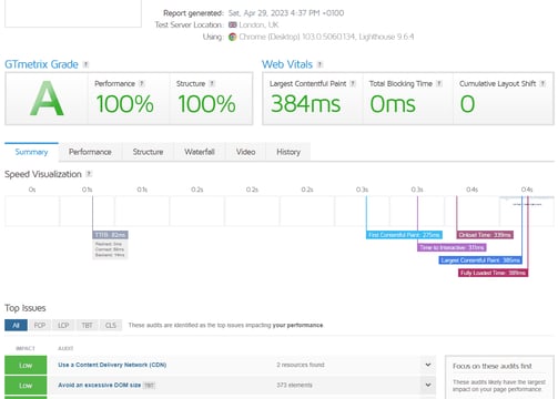
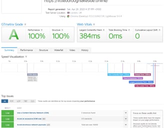
Several tools are available for testing website loading speed, including Google PageSpeed Insights, GTmetrix, and WebPageTest. These tools provide detailed insights into your website's performance metrics, such as loading time, page size, and the number of requests. They also offer recommendations for improving your site's speed, such as optimising images, minifying code, and leveraging browser caching.
Google PageSpeed Insights provides a score for both mobile and desktop versions of your website and highlights specific areas for improvement based on Google's best practices.
GTmetrix offers a more detailed analysis, including waterfall charts that show the loading time for each individual request on your page. WebPageTest allows you to run tests from different locations and simulate various network conditions, providing valuable insights into how your website performs for users around the world.


Newbeltane Tech
Expert web solutions for local and remote clients.
© 2025. All rights reserved. Newbeltane Tech
Services
Get a free 15 mins consultation
Website Optimisation
SEO Optimisation
Web Design
Hosting Consultancy
Digital Marketing
IT Consultancy